The UX Strategy Behind Apple’s Liquid Glass
Liquid glass or liquid ass?
Reading time: 12 minutes

Sayanara, flat, paper-like design. Helloooooo, moving blobs of liquid glass!
Apple recently introduced a completely new aesthetic, which has proven to be quite controversial.
Apple's new aesthetic paradigm is both cool and potentially awful at the same time. It involves surreal animated layers of glass that float over content in the user interface (UI).
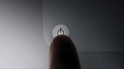
from Apple’s Liquid Glass launch video
“Rather than trying to simply re-create a material from the physical world, Liquid Glass is a new digital meta-material that dynamically bends and shapes light.”
Just when you thought skeuomorphism was dead, it rears its realistic head again.

from Apple
My first thought when I saw this was that it looked like one of those Android skins that phone companies try to sell you along with some meaningless bloatware. The icons look cheap, and the whole effect seems gimmicky.
Normally, you could yawn and move on, but it is Apple…which means your CEO is probably going to ask you to make it "more liquid" in a few weeks.

LOL at this YouTube thumbnail fail from Apple
Is it Liquid Glass or Liquid Ass? Let's take a look.
Liquid Glass and its Accessibility Problems

Some examples where Liquid Glass breaks, according to the internet
Imagine your grandma trying to use this. I hope that Apple figures out how to fix some of this because text will suffer in this theme.
Nobody asked for this update, and I get the feeling that it's creating more problems than it solves.
It's crazy how unusable this UI theme can look outside Apple's fancy keynote presentations.
When done right, it's a subtle layer of 3d rendering that feels slick and modern. When done wrong, it feels like a basement-created WinAmp skin from 2005.
I expect Apple to improve text legibility, especially since the iPhone is a popular choice among older users.
Luckily, you can turn off Liquid Glass in favor of the old UI...for now. So, let's try to look past the obvious accessibility issues for a second.
With Apple, there is surely a deeper strategy behind the update. What might that be?
Planned Obsolescence: The Secret Behind Liquid Glass
Like everything design-related at Apple, a lot of thought went into how to use Liquid Glass across multiple touchpoints. They even staged some behind-the-scenes content in the launch video to show how tactile and real-world Liquid Glass is.
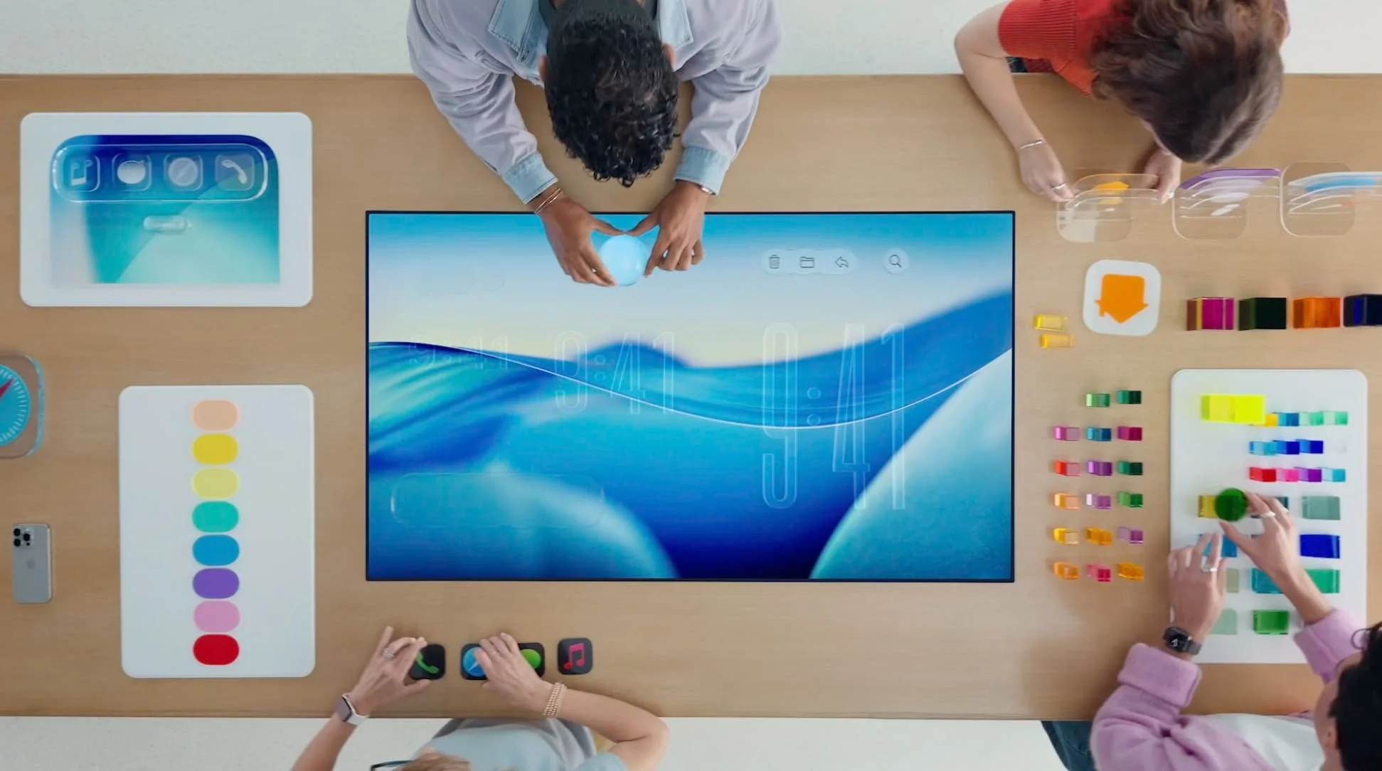
Apple designers working on Liquid Glass
A lot of the thinking behind Liquid Glass started with Apple’s VR work for Vision Pro. Apple is trying to unify those explorations into all of its devices.
Apple has a history of doing this, as it followed a similar approach with the iPhone, using it as a sandbox for new design ideas. Later, Mac got a lot more iPhone-like as they translated their UI innovations from touch to mouse.
I feel like Liquid Glass might become the de facto way to design at Apple very soon. If that happens, it might be worth your time to understand how to apply it.
UX Principles of Apple’s Liquid Glass
Principles are the core of any strategy. You might call them tenets, values, principles, or pillars, and they are the main communicators of a strategy.
Here are some UX Principles behind Liquid Glass that I pulled out from their overview video.
While they’re not explicitly stated, here’s my take:
Layer to Be Realistic: Use multiple layers of material and light to create realistic environmental effects
Aware of the World: The UI elements should feel alive and adapt to other UI elements and the real world
Avoid Glass on Glass: Liquid glass is for the navigation layer as a thin overlay and shouldn't be mixed with other glass layers
Tint to Bring Attention: Use colored glass to bring focus and maximize legibility, but don't color every element
I love how there are dos and don’ts here. I always advise the strategy students in my strategy course to include guidance on what not to do as much as what to do in their strategies. This helps prevent confusion and misuse as it provides specific examples.
The Business Case for Apple’s Liquid Glass
That's a bit about how to use the strategy. Let's look at some potential business problems it solves because design strategy should always align with the business.
Helps Apple stand out from all the Android flatness
Helps them sell hardware since this is a CPU-heavy UI
Helps them repurpose some of their VisionPro UI work IRL
Distracts from all the missing AI features that Apple promised
Gives Apple an excuse to push customers to upgrade
I'm sure all of these are factors, but I think the upgrade cycle might be the real motivation. Apple is seriously concerned with the upgrade cycles of its products, and I bet your company is too.
Apple is so serious about upgrade cycles that it employs a business strategy known as "planned obsolescence," which forces customers to upgrade as often as possible.
Planned obsolescence means manufacturers deliberately designing products to fail prematurely or become out-of-date, often to sell another product or an upgrade – a practice that is barred in some countries. -Consumers International
Apple has been accused of doing this in the following ways:
Making their phones expensive or impossible to repair
Throttling the battery life of older phones remotely
Designing their hardware for fragility
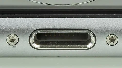
Apple's use of Pentalobe screws makes its phones less repairable
Until now, most examples of this approach have come from hardware.
But I think what we're seeing with Liquid Glass is planned obsolescence applied to the design of software, not just hardware.
Apple encourages upgrades by making dramatic shifts to the UI that make previous versions look boring. By embracing UI trends, Apple can justify faster and faster upgrade cycles.
In short, Apple has built a system where new feels necessary, even when old still works. And while the tech is premium, the strategy is textbook.
This presents some big sustainability issues:
Phones take more power to run UI like Liquid Glass
Old devices can't run the latest software, so they go into the landfill
Users buy new devices more often than they should
Not great for the planet, but good for Apple.
If Apple can get its customers on an upgrade cycle from the design of the user interface, that would be a huge win for them. Despite their fancy marketing videos about Mother Nature, I don’t think that Apple is considering the planet, and they are driven by business concerns with Liquid Glass.
Learn how to design strategy in LIVE, online classes
Join this project-based program for designers that want to learn how to design winning strategies for UX, product, and business.
Graceful Degradation: An Alternative UX Strategy for Apple
There's a term I can't stop thinking about, and it stands in stark contrast to planned obsolescence. It's an entirely different strategy: Graceful Degradation.
Muji's flashlight illustrates it perfectly:

Muji’s flashlight design is a great example of graceful degradation
Here’s a full definition:
Graceful degradation is the ability of a computer, machine, electronic system or network to maintain limited functionality even when a large portion of it has been destroyed or rendered inoperative. The purpose of graceful degradation is to prevent catastrophic failure. -Tech Target
Graceful degradation is all about preserving functionality in any situation, even after years of use.
What if Apple were to design their devices for long-life performance instead of pushing the latest upgrade cycle? And how might that be applied to their UI?
I can picture an alternative world where Apple's software worked equally well on an iPhone 5 as an iPhone 25. Liquid Glass could include a stripped-down, low-power version (that fixes the text legibility). Rather than limiting the aesthetic to the latest phones, you could make the aesthetic feel so uniquely Apple that competitors would never copy it.
You could preserve the core principles of Liquid Glass while making it accessible to sustainability-conscious users, older users, and developing markets outside of the West.
Ironically, you might end up with something that looks a lot like Windows Vista from 2007.

Windows Vista in 2007
Critics of Liquid Glass have already pointed out the similarities to Windows Vista.
If I were Apple, I would lean into this and release a “2007 edition” of Liquid Glass. They could play it as a sort of easter egg and show off the sustainability benefits
With all the fancy updates in the Apple world, this could be a low-risk experiment to see if Apple customers prefer lo-fi UI over hi-fi UI.
After all, it’s the users who decide if a strategy is a success or not through their behaviors.
It will be interesting to see how long Liquid Glass lasts. Apple is good at designing things that become iconic, but I’m not sure if Liquid Glass will be a durable aesthetic.
Fancy UI: The Perfect Distraction from AI
Apple fumbled most of its AI promises from the last WWDC. I guess in times of crisis, they're going back to their roots: innovating the user interface.
As designers, it's hard to be mad about a refocus on aesthetics and UI.
But get ready to spend your entire summer vacation helping your mom learn to use her iPhone again after this update.
Learning resources for UX strategy
Read Reactive vs. Proactive Design by Jeff Humble
Read What is UX Strategy, Really? by Jeff Humble
Watch A Plan Is Not a Strategy by Roger Martin
Get a case study of what not to do in UX strategy in Why Doing Everything is a Bad UX Strategy by Jeff Humble.
Read more about product strategy in WTF is a Strategy by Vince Law
Read about the role of Strategic Designer in What is Strategic Design? An In-Depth Guide by Jeff Humble.
Get your company to fund a course in UX strategy with 6 online workshops to guide you in designing a winning UX strategy: Defining UX Strategy: LIVE by the Fountain Institute.
![The UX Strategy Template Your Team Actually Needs [Free Canvas]](https://images.squarespace-cdn.com/content/v1/5dc5935a7224ad2839d7e750/1769035489412-65KNDYBSE7B83C4V6CTJ/UX_Strategy_Template-Fountain_Institute%28thumbnail%29.png)


What’s your take on Liquid Glass?
Drop it in the comments!