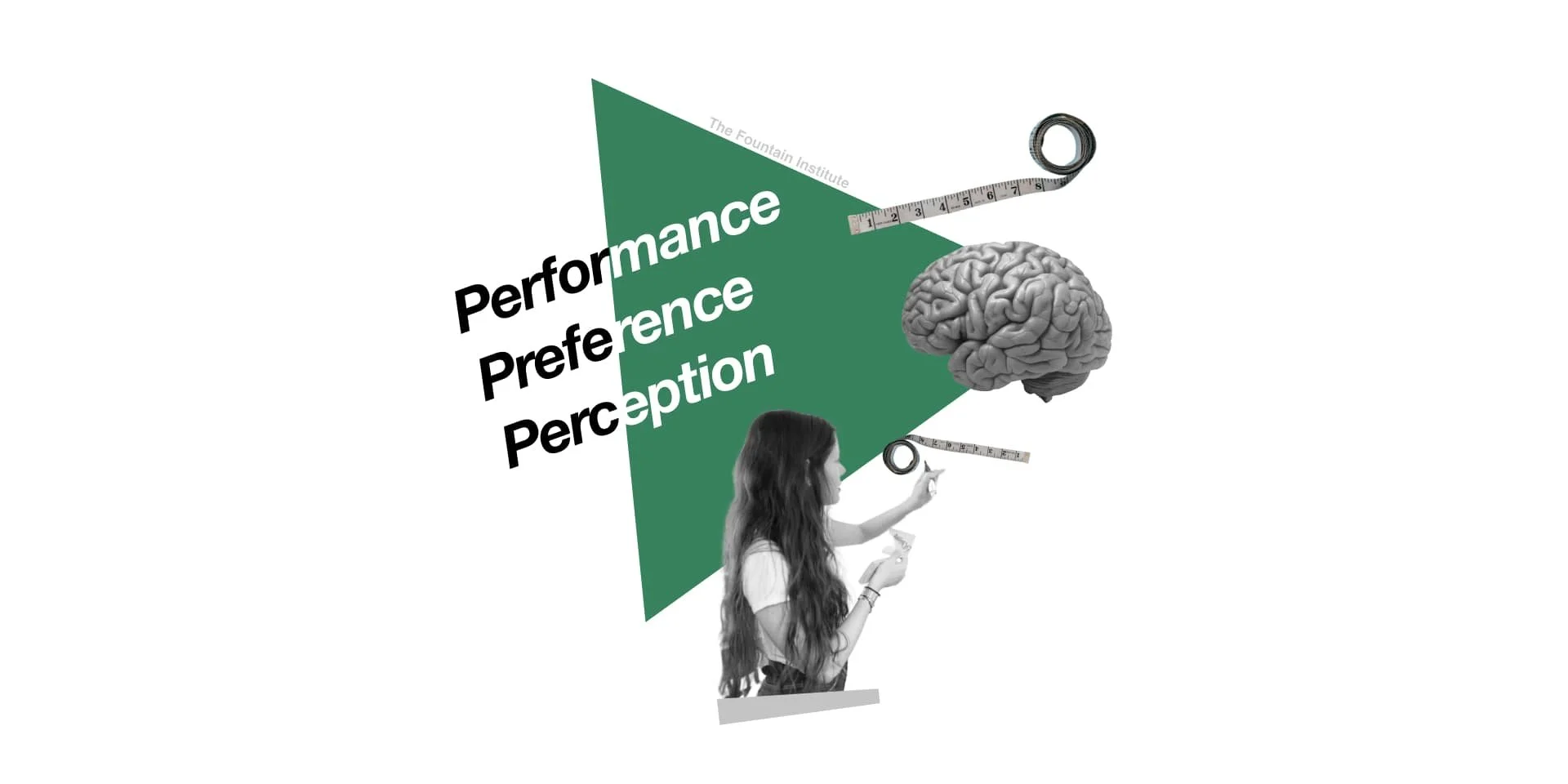
3 P’s of Measuring the User Experience
How to pick the right metrics and sample sizes with the 3 most common UX measuring goals
Reading time: 21 minutes
So you want to measure the user experience, eh? It’s worth the effort.
Organizations value UX more when they can measure and show the impact of good user experiences. But it’s not going to be easy.
Which methodology will you use to measure? Which research methods are needed? How many users should you study?
You don’t need many users to improve the user experience (UX). You can form deep user insights just by talking to 5 users. But to measure the UX confidently, you will need more.
You need to understand your measuring goals to get the most from your user research efforts. Once you understand your goal, the rest will make more sense.
[framework adapted from Measuring the User Experience by Tom Tullis & Bill Albert]
I adapted the 3 Ps of measuring UX from an excellent book called Measuring the User Experience. It works because the context of measuring is crucial to all the numbers involved. I use this easy-to-remember framework to teach UXers how to identify the methods and sample sizes they need for UX work.
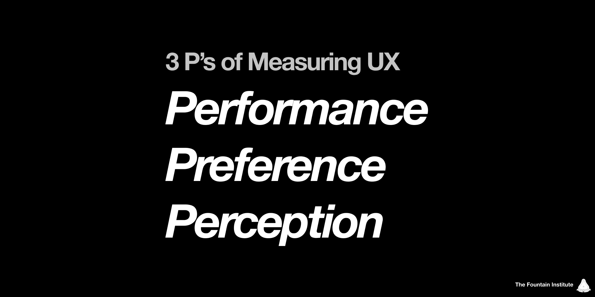
It’s called the 3 P’s of Measuring UX:
Performance - refers to how quickly and efficiently a user performs a task within a product or service. Designers measure user performance through task time, task completion rate, and error rate.
Preference - refers to the users’ subjective choices regarding a product or service. Designers measure user preferences through preference tests, A/B tests, web analytics, and surveys.
Perception - refers to the users’ understanding of an experience using a product or service. Designers measure user perception through self-reported surveys like SUS or SUPR-Q that determine usability, findability, and aesthetics. Through facial recognition and body sensors, sophisticated tools can measure users’ frustration, surprise, and stress levels.
Let’s look at the 3 P’s in detail, along with many examples.
1. Measuring performance

Performance testing really took off in World War II when military engineers discovered they could save pilots’ lives by studying the performance of airplane cockpits. Moving a display alone could minimize pilot errors and ensure the pilot could operate the plane quickly and safely under high-pressure situations. Usability and performance data was a life-or-death situation. Today’s usability and performance studies work on this foundation of performance measuring.
Performance metrics measure how the user behaves during a task. The classic usability test is an example of performance measuring, using performance metrics like speed and error rate to determine if a user (and thus the design) is performing well.
Simple Example:
For a simple performance study, you might be troubleshooting big issues with a new design feature. Maybe you’ve got a few wireframes and want to see which has the least issues. Or maybe you’re trying to catch the big stuff before sending your design to the developers. In that case, you might measure error, error severity, and task success rate.
Advanced Example:
For an advanced performance study, you might optimize details of a critical flow in your product, say a checkout flow. Improving small aspects of a page with high traffic can save millions of dollars. You might look at task time, drop-off rates, and findability of the buy button.
Whatever you’re doing, performance metrics talk about the user's action. The task provides the scope for the measurement in a usability test, but you could also use your product analytics tool to look at user performance overall.
Sample size in measuring performance
Most designers start their careers thinking they only need to talk to five users when doing user research. Unfortunately, you probably need more.
I know. That guy from Nielsen Norman Group said you could test with five users and be fine. That’s a specific context, but most designers misapply this rule of thumb to every user testing context. There are a million research methods, each with its own rules of thumb and metrics.
You can get away with smaller numbers of participants with performance studies. That’s because you’re taking advantage of the fact that if one person finds a problem, it’s likely a problem for more. Remember, you’re testing how users perform with a design, not whether they prefer it.
Here’s the graph that everyone references for usability tests:
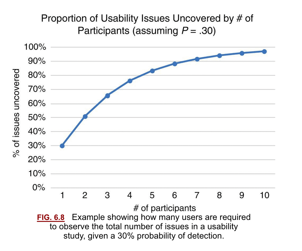
[from Measuring the User Experience, a very good book on UX Metrics]
Notice that it’s visualizing the “usability issues uncovered.” That’s an important context for using this rule of thumb.
The classic “5 users rule” holds true, but it only applies to troubleshooting a design. It's not going to tell you which design is better. It shows you where the problems are. By studying the performance of average users, you can get a pretty good idea where to improve things, but it won't tell you if your users will prefer one design over another.
You can get away with five participants in performance studies because if the average user finds a problem, it will likely be a problem for more. Perception surveys and qualitative interviews follow most performance measures to better understand more than the observed problems. It’s important to balance how a user performs vs. how they feel about the experience (more on that in preference metrics).
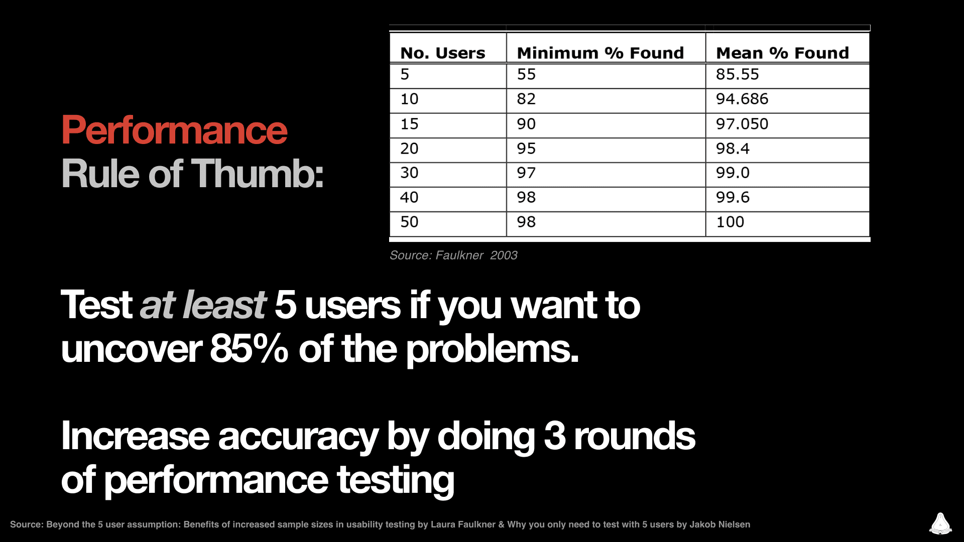
Doing multiple rounds is preferred to a single round of testing because it reduces the possibility of your test setup being faulty. A pro move is to get those 8-15 users in 3 rounds of studies. The more repetition you can do while studying users, the more your numbers will become accurate.
Testing with 5 users takes all day, so breaking the testing up is easier and more agile. You can even run an evergreen study every quarter to set a benchmark for your product.
Rule of thumb: Test at least 5 users to uncover 85% of the problems. Aim for 3 rounds of testing with 5 users.
Here's a saveable image with more benchmarked numbers for testing user preferences:
Remember, you’re testing how users perform with a design, not whether they prefer it. If you’re interested in which design users like better, you need preference metrics to see if one design is preferred over another.

Check out our archive of advanced design resources
Get Free Resources like design tools and masterclasses from the Fountain Institute.
2. Measuring preference
Measuring preference means comparing user’s choice when presented with alternatives. Measuring preference is extremely useful in the solution phase when you have several good ideas, and you’re trying to figure which choice the user will make.
It’s tough to say that many people prefer one thing over another. But the payoff can be great. Imagine knowing which design will work best before you launch it. Imagine being able to compare the UX of your product to a standard.

You can use tools like Usability Hub or UseBerry to run an online preference test easily. These asynchronous testing platforms allow you to set up a test, send it to a user segment, and watch as the results flow in. You can also test for preference synchronously in an online user test. Still, the sample size required for reliable preference test results makes a moderated approach impractical without advanced testing knowledge.
Sample size in measuring preference
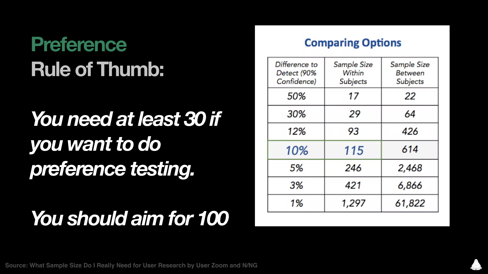
Preference metrics give us a glimpse of the most desirable choice, according to users. 8 to 12 users may help you troubleshoot a design, but you will need at least a hundred to determine user preference.
Look at this example of two preference tests where two user types were tested for preference. This graph shows the breakdown of results with sample sizes of 115 and 421:
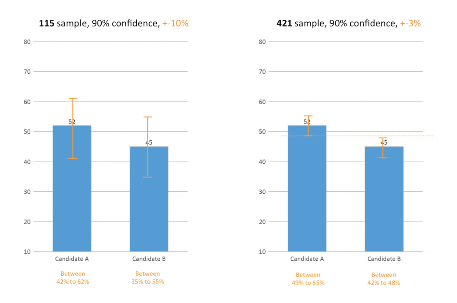
[Graph from an excellent article by Kuldeep Kelkar]
See those orange lines and text on the graph? The Margin of Error is written here as +-3%. Notice how it goes down with a bigger sample size. In the sample size of 115, those blue bars could vary so much that you can't get a solid answer.
The 90% confidence talks about the confidence level or repeatability of the setup, and it's 90% for both tests. We can ignore that for now, but you can use a 90% confidence level for quick and dirty UX stuff, but 95% is what scientists use.
A/B tests generate preference metrics in an as-close-to-real-world-setting-as-possible, so they’re more reliable than preference tests (but also more expensive). Pro designers run product experiments early with concept tests using different prototypes to study the preference of designs long before a live-coded A/B test.
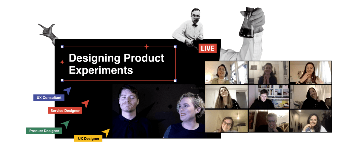
I teach a course on product experiments, where we learn advanced ways that designers can test with performance and preference. It’s an emerging role for designers but extremely valuable for companies. Imagine finally being able to tell which ideas are usable and desirable by users. If you understand that, imagine how much you could accomplish.
Rule of thumb: You need at least 30 users to measure preference. Aim for at least 100 to get a reliable minimum.
Here's a saveable image with more benchmarked numbers for testing user preferences:
Whether it’s a survey, live-coded A/B test, or an early product experiment, measuring preference helps you avoid designing something nobody wants. The team’s perception of a good experience doesn’t always translate to the user’s perception of a good experience.
Next, it gets weirder. It’s time for the perception metrics.
3. Perception metrics

[clip from “Playtest” by Black Mirror]
Perception metrics measure the feelings, emotions, and secret thoughts of users. And yes, that's as weird as it sounds.
Perception is usually measured with self-reported surveys, which is pretty subjective, but new tools like AI-assisted facial recognition make measuring emotion more objective.
Self-assessed perception measuring
Perception metrics are often combined into scores, such as QX score by UserZoom. Two of the most popular UX scores in measuring perception are SUS and SUPR-Q. These UX scoring methods use carefully-chosen survey questions that have been studied and benchmarked for high accuracy. You might use one of these survey methodologies before and after a performance test on users.
Don’t confuse these UX scores with analytics dashboards. Analytics dashboards typically measure performance, but a custom dashboard might measure all 3 P’s. A UX score offers a viable way to test the qualitative side of UX where perception lives.
UX scores like SUS and SUPR-Q are based on self-reported user perception. You might recognize similarities in perception measures with brand perception surveys. Like brand perception, they're based on self-reported user attitudes and are often administered before and after a performance study.
Self-reported surveys on perception are limited, but they get better with repetition. It’s standard practice to poll users about perception before and after a usability test. You can feel more confident in your design decisions if the user self-reports that it was a good experience for them, even if the user didn’t quite understand the flow.
Automated perception measuring
Measuring perception can get quantitative, too, but it gets weird here. Skin monitoring and facial recognition provide quantitative user perception data if you can afford it. Thanks to AI, you can record a user testing session and augment the results with perception data such as surprise and stress levels.

[clip from “Playtest” by Black Mirror]
These quantitative perception measuring tools will undoubtedly get cheaper and more accessible for design teams. In the 90s, eye-tracking (generally a performance measure) once required an expensive usability lab. Now you can do it on a smartphone with something like Eye-Square.
Perception Metrics help you track hard-to-measure things like ease, frustration, surprise, trust, and stress. The methodology is complex and unique to the software doing the measuring. So if you're new, start with performance and then move to preference and perception as you grow your research toolbox.
Maybe we'll measure perception with a simple neural scan in the future! Science fiction shows like Black Mirror showcase this kind of perception measure in episodes like “Playtest.” Who knows, maybe it will be possible in a few decades?
Triangulation & the 3 P’s of Measuring UX
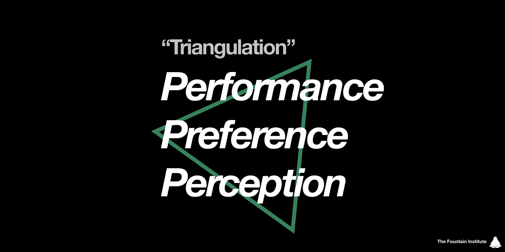
Even if your measuring goal is performance, you can always reduce bias and save time by including preference and perception measures in your study.
While performance is the dominant “P” for designers today, if you want to know about more than problem-finding, you want preference, too. And it’s always a good idea to balance performance and preference with a bit of perception. Often you measure performance and preference with behavioral tests and measure perception through attitudinal tests.
Try to use all 3 Ps of measuring UX in every study. This reduces blind spots and increases the overall accuracy of your results.
Triangulating example with all 3 P’s
Let’s say you have a new idea and do not know if it’s good. You design a few early versions but want to get the user involved. You could run a 60-minute research session with 10 users where you do a performance test on several user flows, a post-test perception survey like SUS, and a bit of qualitative interviewing at the end to get some deeper insights about the perception and preference elements at play. If you’re on the right track, run several preference tests with a user segment in an online tool like Usability Hub to see which approach is more desirable. You could launch with a preference-focused A/B test using Optimizely and continue to watch performance using Amplitude, your team’s product analytics.
Triangulating is eye-opening once you start to do it. I’ve seen dozens of user tests that were awful from my perspective, but the user rated the experience as overwhelmingly positive. I’ve also had users say they prefer one design, but the preference data doesn’t reflect that at all. What people say, do, think, and feel are often at odds with each other.
Designers are experts in usability, but your users are not. Don’t make assumptions about their experience without measuring it.
Learning resources for UX metrics
Read the book that inspired this framework: Measuring the User Experience by Tom Tullis and Bill Albert
Read How to Set UX Metrics with the Google HEART Framework by Jeff Humble
Get resources on measuring UX from Tom Tullis and Bill Albert
Read Surveys are the McDonald’s of UX Methods by Jeff Humble
Get resources on quantifying UX from Jeff Sauro, PhD
Read The Designer’s Guide to Testing and Experiments by Jeff Humble
Learn more about sample size in UX with this article on UX sample sizes by Kuldeep Kelkar
Read What is Continuous Research? by Jeff Humble
Watch this Free 60-minute masterclass called How to Lead with UX Metrics by the Fountain Institute
Get trained in metrics and experimentation by the Fountain Institute
Join this 4-week course where we will guide you through setting up UX metrics and product experiments for your company


What methods and tools do you like for measuring the UX?
Share them in the comments!