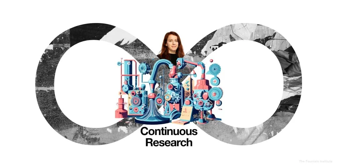
How Eleanor Applied Continuous Research to Her UX Practice
A case study on how to use weekly research to improve product decisions
Reading time: 15 minutes
Switching careers can be daunting, especially when moving into a dynamic and rapidly evolving field such as tech. As someone who spent years in the fashion industry, I was drawn to UI/UX design as a logical bridge into tech, leveraging my skills in visual design, customer behavior, and trend awareness.
However, as I delved deeper into the world of UX, I realized the power of good research in underpinning the success of any product. This new aspect of my job quickly became one of the most fun parts, but as colleagues began to seek my expertise on UX and research queries, I couldn't help but feel a touch of imposter syndrome. I wanted to be confident in my research techniques and make informed decisions, but I didn’t feel that relying on trial and error or YouTube videos was enough.
Enter the Fountain Institute, which specializes in building skills for mid-career designers, providing a supportive environment for peers to exchange feedback and share design stories. I eagerly signed up for their Continuous UX Research course, which offers a powerful research practice with a regular weekly cadence making it possible to proactively uncover new opportunities, rather than waiting for months for a hefty research project to materialize.
Several months after completing the course, I am excited to share how I have implemented the techniques I learned to enhance my daily work.
Weekly methods of continuous research
It’s a relief to know that research is not all about big projects recruiting perfectly matched test subjects: there are many lower-stakes research methods you can easily fit into your workweek or even set in motion while you sleep. I really love this concept of continuously growing your bank of information around a subject organically, rather than focusing on one big unwieldy research project at a time.
This approach has helped me schedule weekly discovery interviews, inform bi-weekly analytics check-ins and more, to keep my finger on the pulse of user behavior around insurance.
Here are the approaches that I have used from the course in UX design practice.
1. Discovery Interview
The Discovery Interview is an interview technique that asks users to share stories about their experience. This technique has been key for me as it helps me understand the user’s landscape and perspective while uncovering insights and opportunities.
Discovery interviews use an open-ended interview technique that teases out the details of users’ real, lived behavior to understand their needs better.
Rather than asking users what they would like or having them speculate on the future, discovery interviews focus on past experiences. By asking about experiences and the recent past, your data will be more reliable. Plus, it’s a lot easier for users to talk about themselves and their lives.
I work for an insure-tech and took on a project to discover how we might improve the claims experience for our end users. This offered a great opportunity to test drive the discovery tips and tricks I had learnt on the course. I ran ten discovery interviews with testers matching our user profile and discovered their needs, pain points, and desires around making pet health insurance claims. This helped to crystalize our priorities when re-designing the claims experience and informs the current overhaul of our claims process.
2. Discovery Walkthrough
The Discovery Walkthrough is an evergreen setup where you observe the user use your product in near-to-real conditions. Rather than scripting the interview, you watch a user work in their normal flows. This lo-fi usability test lets you problem-find without preparing long studies.
Watching users use the product has been super helpful in ensuring that we are all on the same page when understanding the problem, keeping the user perspective at the forefront of design and build decisions.
I’ve often used the discovery walkthrough when working on various features for internal stakeholders, often with co-members of my ‘product trio’ (in my case, a lead dev and a product owner).
Insurance can get quite complex: part of what we do is design digital solutions for internal stakeholders. Their work is quite specialized, so it is crucial to understand their workflow to design effective solutions for them. What better way to get a window into their world than with a discovery walkthrough?
Running discovery interviews and walkthroughs with internal stakeholders has also been a great way to network within my own company: I’ve found that colleagues are very willing to share their needs and pain points around their daily work and in turn it’s helped me deepen my understanding of the inner workings of my company and the complex products we are building.
3. Collaborative Synthesis
Collaborative Synthesis is a group activity where you shuffle and re-sort your research data to make sense of the data as a whole. You’ve probably done some simple affinity mapping on your own, but this method takes clustering to a whole new level with advanced re-sorts and stakeholder involvement.
Collaborative Synthesis is a fun and effective way to get everyone on the same page about research insights and interpreting patterns together. It’s also an excellent way to mitigate personal bias and encourage that all-important but sometimes elusive stakeholder buy-in.
Circling back to the pet health claims example, I ran a workshop to collaboratively look at all the data around pet claims: our discovery interviews with users and stakeholders, analytics, and some desk research around customer portals. As a team, we were able to group information into themes, insights, and needs to really define an area of focus for improving the claims experience.
I carried out the synthesis activity first alone and then as a team to compare the results individually vs. collaboratively. It was exciting to see the different, broader perspectives that emerged when we tackled this topic collaboratively, which really highlighted to me the power of collaborative affinity mapping over working in a more siloed way.
4. Opportunity Solution Tree
After the Collaborative Synthesis activity, we created an Opportunity Solution Tree (OST). An OST is a tree map that visualizes the entire research process in branches, starting with outcomes and moving to opportunities, solutions, and experiments. It’s a great place to check in on user research with your stakeholders to make sure your research is moving your desired business outcomes.
Having identified the most pressing, impactful problem (or opportunity, if you will) using our tree hierarchy, we brainstormed solutions individually. Freeing ourselves up to come up with as many ideas as possible by initially opting for quantity over quality turned out several promising solutions I would not have thought of by myself. I found that the OST was a great way to bring in your stakeholders' and colleagues' individual expertise and experience.
5. Research Repository
A research repository is a central place to store your user research learnings. The research repository works like a wiki to present your company's user research data, and they’re a great way to present continuous research results.
Over the months and years, user research projects have been undertaken by various people about various topics, but finding them can often involve considerable detective work. I suspected that I myself was part of the problem, keeping all my research in elaborate and (as I thought) beautiful Miro boards, intelligible only to me. But how were consumers of research at my company experiencing it?
I decided to run some internal research about research to find out. I used discovery interviews with internal users and contributors in my company to take me through their journey of accessing research and data and discover their needs and pain points around this.
A key discovery I made is that my colleagues wanted a clear and searchable system summarized in digestible nuggets so that you can easily see research results at a glance and the decisions made based on them.
A complex write-up or messy Miro can be an overwhelming distraction that can confuse or dilute the research findings.
With some inspiration from DIY repositories out there, I set up a system in Confluence to categorise experiments, facts, insights, and recommendations in an easily searchable manner. As with all UX creations, it’s a work in progress, but so far, I have positive indications that taking this approach has led to a more user-focused solution for presenting research.
Conclusion
The Continuous UX Research Course has made me a confident advocate and activist for research in my organization. The powerful tools and techniques I learnt have changed my weekly schedule and mean I can stay current and aware of new opportunities as they arise. One of the most enjoyable additions to my process is the collaborative activities: collaborative walkthrough and synthesis workshops have been a fun and effective way to get cross-functional team members invested in discovery and solution generation and harness their unique expertise and perspectives.
It is no exaggeration to say that the continuous research course has been a real game-changer for me. I’d recommend it to any UX designers wanting to take a more central role in company strategy and make product decisions backed by solid and compelling research.
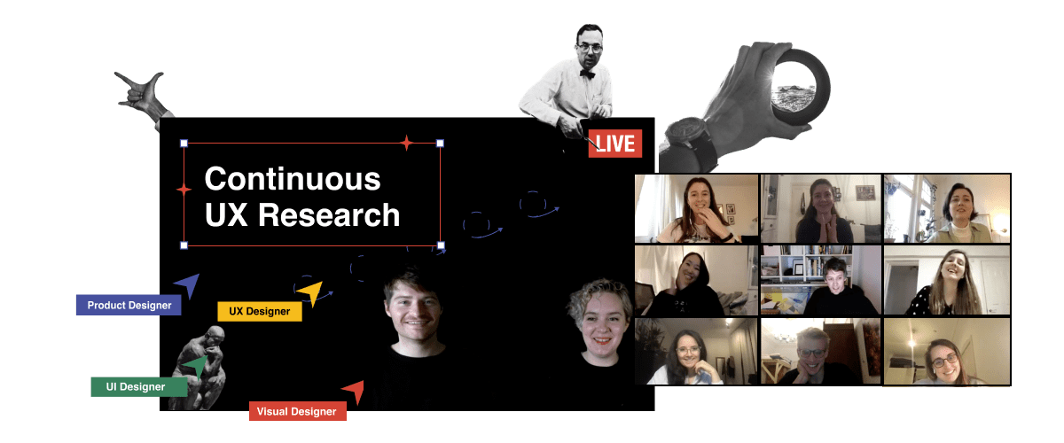
Join the next cohort of Continuous UX Research: LIVE
Free Resources on Continuous Research
Watch a free masterclass on continuous research called How to Do UX Research Weekly by the Fountain Institute
Read What is Continuous UX Research by Jeff Humble
Read Continuous User Research in 11.6 Seconds to learn more about Continuous Research from the creator of the Atomic Research Nugget, Tomer Sharon
Read Continuous Discovery and learn more about Continuous Delivery and Continuous Discovery from the founder of Discovery, Marty Cagan
Read The Role of User Research in a Continuous Discovery World by Teresa Torres
Use the free asset: Interview Debrief Card by the Fountain Institute & turn interviews into insights with your team
Watch a free masterclass called Unlock Your Team’s Research Potential by the Fountain Institute

![How to Write User Research Insights [Full Guide + Template]](https://images.squarespace-cdn.com/content/v1/5dc5935a7224ad2839d7e750/1675267033185-M8VCTMNY0VJUU988U4J1/Insight_Card-Blog-Thumbnail.jpg)

![What is Product Discovery? [Process, Methods, and Benefits]](https://images.squarespace-cdn.com/content/v1/5dc5935a7224ad2839d7e750/1665227887540-3TFXCIV7QZQTDMRNVEXJ/What_is_product_discovery-Fountain_Institute%28thumbnail%29.png)

