10 Ways That UX Research Report Could Have Been Shorter
How to evolve research reports to be more engaging for stakeholders
Reading Time: 7 minutes

“Check it out and leave me some comments!” …these are famous last words for a UX researcher.
When I said them, I was pretty new to doing research at companies and had just shared an academic-looking document with my product team.
I thought I was clever for using a Google Doc to gather comments on my report. I only got a few pity comments from the product lead.

[🎶 To the left, to the left...everything I learned in a huge PDF 🎶 meme by Jeff Humble]
I should have known better.
That same product lead used to print out research reports she wanted me to read. She would leave them on my desk because she knew that was the only thing that worked.
When it came to reports, she understood what I didn't.
Expecting unrealistic behavior
Ironically, I was a designer doing research, and my research report was completely redesigned. I turned off my design brain and sent out a barely-formatted report.

Why do we put important things above the fold on websites? Why do we add bullets, drop-downs, images, and clear navigation? We do that because we know the truth…nobody reads.
At best, people skim and tell you they read (find out with a PDF heatmap). Consider your front-end developer. Consider your UI designer. Do they want to read your 72-page report?
We don't expect this much from users and probably don't even follow this unrealistic behavior ourselves.
Your research report is like any piece of content. If it's too hard to consume, people won't. Think highlights reel or movie trailer...not an early draft of the script.
Try formatting it like a newspaper article with the most important thing first. Use the Minto Pyramid if you need some guidance.
As for the report format, let go of those PDFs and Google Docs. UX Research, meet Content Design...🤝
10 ways to user-centered Research Reports.
(from easy to challenging)
Record a screen share of the report w/ your highlights (try Loom)
Make a meme to hook your reader into exploring your findings (use Kapwing)
Make a visual presentation and share it instead (try Pitch)
Make an interactive mind map and ask for feedback (try kumu.io)
Make a poster with a QR code for the office (try Figma + bit.ly)
Create a highlights reel of research moments (try Dovetail)
Turn your report into a drip campaign and send it out in small chunks (try Convertkit)
Display your research in a non-linear canvas and invite stakeholders to sort and structure it (try ultra.tf)
Make a fun research summary video that hooks people without text (use Canva)
Gamify the report with a workshop and invite people to create something new with your findings (try Miro)
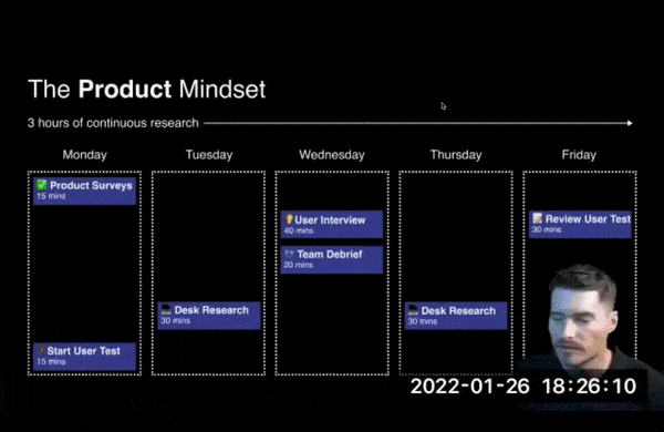
If you want more creative ideas on moving beyond research reports, check out this talk from UX researcher, Basim Al-Baker:

Beyond Deliverables
It takes work to help people understand. Of course, you could go beyond deliverables and involve the team instead. It's also a great way to get the whole team to research every week.
It's easy to complain that nobody does research, but it's hard to do something about it.
This video is about how you can do something about the lack of research at your company.
Bonus: if you're bringing the team into research activities, you don't have to make a research report ever again.