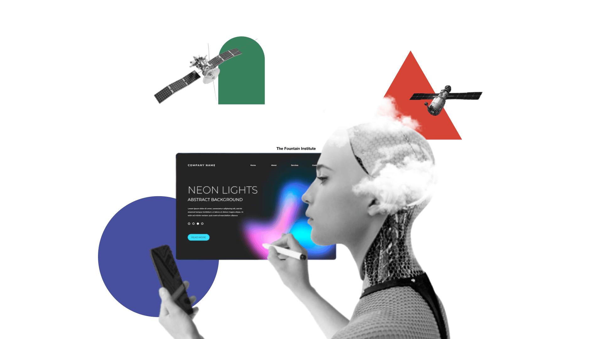
7 Signs a UI Has Been Vibe Coded (And How to Avoid Them)
The design patterns that reveal an AI-generated interface, why they keep appearing, and how to avoid them.
Reading time: 6 minutes
Vibe coding has a look. Once you know it, you start seeing it everywhere: in the dashboards that launched last quarter, in the internal tools nobody uses, in the startup landing page that somehow has twelve colors and three fonts and still manages to say nothing.
The term gets used loosely, but in practice vibe coding means generating a user interface by prompting an AI and shipping whatever comes out, without applying any real design judgment to the result. It's fast. It's cheap. And it produces a recognizable visual signature that has nothing to do with the product it's supposed to represent.
These patterns aren't random. They're statistical artifacts from the model's training data, the visual equivalent of autocomplete. The AI isn't making design decisions. It's making predictions about what "modern UI" looks like based on what got upvoted on Dribbble in 2022.
Here are seven patterns that give it away. Learn them, and you'll never look at a product screenshot the same way again.
1. Neon color palettes that refuse to prioritize anything
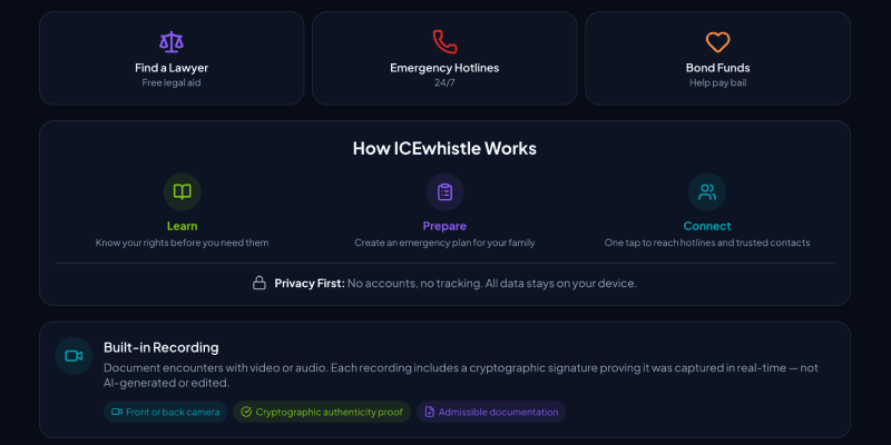
from ICEwhistle
Vibe-coded interfaces love neon, especially five or six competing for attention at the same time. Electric blue next to hot pink next to acid green, all at full saturation, none of them doing anything in particular.
The reason for this is boring but useful to understand. Neon-on-dark photographs well and performs on social media. It was massively overrepresented in the "modern SaaS UI" content that ended up in model training data. The AI learned that high-chroma colors on dark backgrounds equal contemporary design, and it applies that lesson regardless of context, brand, or what the interface is actually trying to communicate.
The result is UIs where everything is shouting at equal volume. There's no hierarchy, no breathing room, no sense that any one thing matters more than anything else. It feels energetic for about 10 seconds, then becomes exhausting.
The fix: Pick one dominant color, one accent, and one neutral. Everything else is noise. Visual hierarchy comes from contrast and restraint, not from adding more colors to the pile.
2. Dark mode with decorative glow effects that serve no purpose
from Askew.ai
Ah, the aurora borealis background and glowing text with radial light bloom sitting behind the hero section for no particular reason. These have become so common in vibe-coded interfaces that they've started to feel like a genre rather than a design choice.
Dark mode itself is fine. The problem is what the model learned to pair with it. Gaming sites, crypto projects, and AI product launches all used radial gradients and glow effects heavily during the period when most training data was collected. The pattern got absorbed as a rule: dark background plus glow equals premium. The model applies it whether the product is a fintech dashboard or a recipe app.
The practical consequence is that these effects carry no meaning. They don't indicate interaction, status, or hierarchy. They're decoration that competes with content, and on a screen with any kind of ambient light, they make you wonder if something is wrong with the display.
The fix: Dark mode earns its depth through typography, contrast, and the thoughtful use of surface levels. If a visual effect isn't responding to user behavior or communicating something specific, it probably shouldn't be there.
3. Emojis used as icons, bullets, and navigation items
from AI Sentia
The AI-generated interface has discovered emojis and will not stop using them. Not as occasional personality in microcopy, which can work fine, but as navigation icons, section headers, bullet point replacements, and decorative background elements scattered across the page.
This happens because product onboarding flows and marketing copy in the training data use emojis constantly as a way to add visual rhythm without building actual icon assets. The model absorbed this as a general-purpose design move and now applies it everywhere, including in contexts where it looks genuinely baffling.
There's something revealing about it. Emojis as UI elements are a shortcut that says the interface never needed to make a real decision about iconography. A consistent icon set requires thinking about meaning, weight, and visual language. A string of emojis requires none of that.
The fix: Emojis belong in communication contexts where tone and personality matter. Interfaces need icons, and icons need a system. They don't have to be custom-drawn, but they should be consistent, purposeful, and sized correctly for the context they're in.
4. Purple gradients on everything
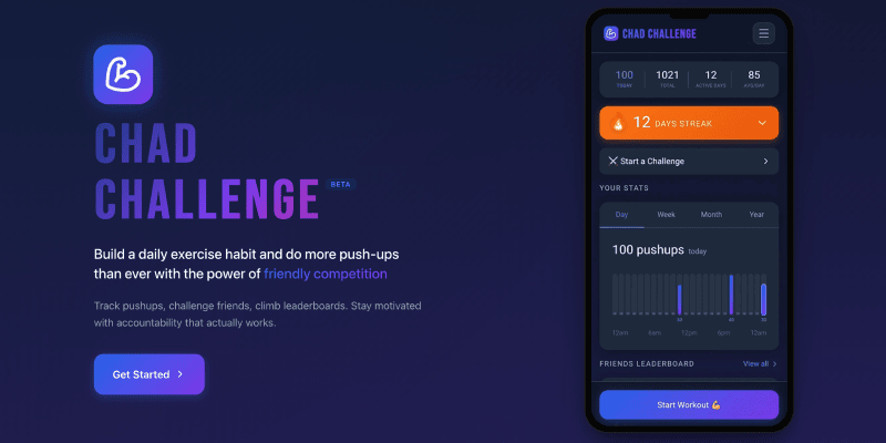
from ChadChallenge.club
Purple-to-indigo gradients have become the Times New Roman of AI-generated design. The model reaches for them the way a distracted writer reaches for "utilize" instead of "use." It's not wrong exactly, but it's a tell.
The statistical reason is straightforward. Purple-to-blue gradients appear in the marketing materials for Notion, Linear, Vercel, and a few hundred of their imitators. That cluster of influential, widely shared product design became a significant chunk of what "innovative software" looks like in training data. So when the model is asked to design something that feels forward-looking and technical, it reaches for the gradient most reliably associated with those qualities.
The problem is that this was never a brand decision to begin with. It was a trend. And like all trends, it has a shelf life that the model has no way of tracking.
The fix: Color should come from what the product is and who it's for, not from what other products in the category happened to do. Starting from brand values and working outward produces colors that actually mean something.
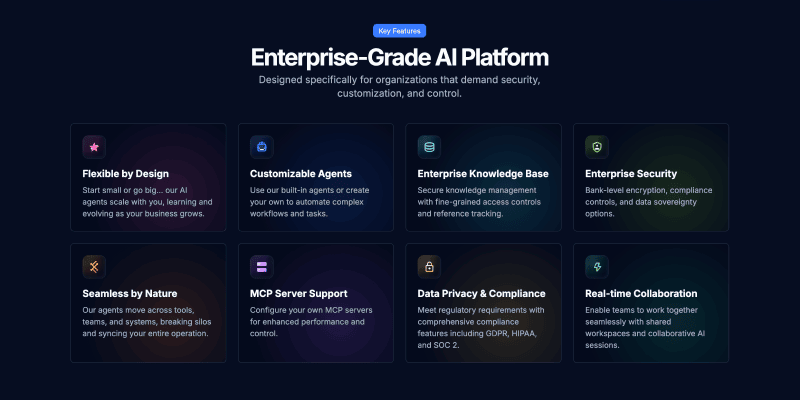
5. Cards for every block of info
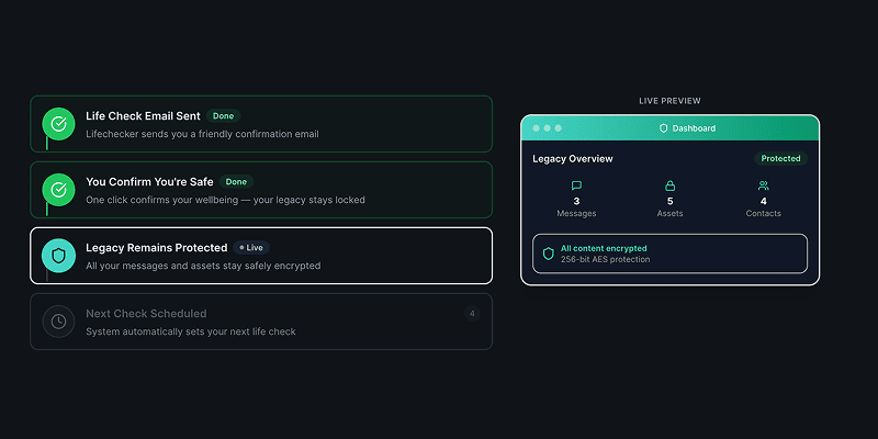
from LifeChecker.app
In AI-generated interfaces, everything goes in a card. Then those cards go in a card. Then that card goes in a card. The nesting can get three or four levels deep before anyone notices, by which point the interface looks like a filing cabinet inside a filing cabinet inside a filing cabinet.
The underlying logic makes a kind of sense. Content needs containers. Containers help group related things. But the model applies this rule without any cost function for visual weight, which means it keeps wrapping until everything is equally contained and nothing reads as more important than anything else. The chaos is perfectly organized.
Cards are a meaningful UI pattern when they indicate that something is independently actionable or can be interacted with on its own terms. When everything is a card, that meaning disappears. The visual language stops being a signal and becomes static.
The fix: Use whitespace, proximity, and typography to create grouping. Cards should be reserved for things that genuinely benefit from the affordance of a bounded, interactive object. Most content does not need a box around it.
6. Multicolored side tabs on every block of content
from TubeScout.app
A thin vertical bar on the left edge of a card or content block. Seems harmless. But in vibe-coded interfaces, every single block gets one, and each one gets a different color: red, then blue, then green, then orange, cycling through the palette with no discernible logic.
These have become the design equivalent of the overused em-dash. They appear because the model knows that active states and selected items should have color, and because individual components look styled when they have an accent. What the model cannot reason about is the color budget of the whole page. Four competing accent colors don't add up to four highlights. They cancel each other out. Nothing is emphasized when everything is emphasized.
The rainbow side tab collection is a good example of the broader problem with vibe-coded design: locally it looks fine. Globally it's chaos.
The fix: Treat color as a shared resource across the interface. Define which things get accent color and why, then hold the line. Emphasis only works when there's something to contrast it against.
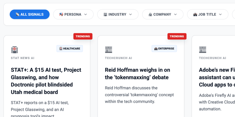
7. Status dots that don't mean anything
from JobsData.ai
At some point, a small colored circle meant something. Green dot: this person is online. Red dot: this service is down. Green and red dots near a graph? A helpful key to explain the data. The dot carried information because it was used sparingly, in specific contexts, for a specific purpose.
In vibe-coded interfaces, status dots appear on everything. Navigation items, card headers, data labels, section titles. The colors change arbitrarily, and nothing is actually being communicated, but everything looks like it might be important.
The model learned this pattern from developer tools and admin dashboards where status indicators genuinely matter. It extracted "colored dot equals status information" and started applying it globally, losing the entire point in the process. A dot is only useful when the user understands what state it represents and can take action based on that information. Decoration that looks like data is actively harmful to usability.
The fix: Every status indicator should map to a defined state, and that mapping should be communicated somewhere. If a dot requires explanation, a text label was probably the right call. If nothing is actually changing state, remove the dot entirely.
What these AI tells have in common
None of these patterns is a mistake in the traditional sense. They're not caused by carelessness or ignorance. They're caused by a model optimizing for statistical association rather than design intent. The model doesn't know what your product does or who uses it. It knows what "modern UI" has looked like, in aggregate, across millions of examples. It gives you the average.
The real tell here is average. Vibe-coded UI looks like everything because it was trained on everything. It has no specific point of view, because the data it came from lacked a unified one. Good design is the opposite of that. It makes specific choices about what to say and what to leave out, what to emphasize and what to suppress, what the interface should feel like at the moment someone first encounters it.
None of that comes from prompting. It comes from understanding the product, the user, and the context, and making deliberate decisions from that understanding. The seven patterns above are all examples of what happens when that judgment gets skipped.
Learn More about Designing with AI
Check out more anti-patterns in vibe-coded UI at impeccable.style and use it to remove these trends from your projects
Look at more Vibe Coding Examples on Reddit to get a better vibe for what not to do
Read The Double Diamond Meets AI to learn how AI can change your design process
Watch Strategy as the Human Layer to learn how to build a strategic mindset with AI
That's seven, but there are more. What did you notice that I missed?