The 3 Most Iconic UIs in Film
The best graphical user interfaces (GUI) and data visualizations from films, ranked by a UX designer
Reading time: 5 minutes
What does it mean when you ask yourself if a movie is “iconic”?
When casually discussing the impact of a cultural good like film, one often resorts to using some loose, on-the-fly rubric to help paint a better picture of the production. High marks in categories such as set design, music, fashion, dialog, and plot/character development are all factors that elevate some pictures to the heights of timelessness and greatness, while lower marks across the board may mean just the opposite–getting relegated to irrelevance or worse, infamy.
For now, we’re going to cast aside most of the criteria mentioned above for determining a film’s greatness and judge the entire film solely on the quality of its user interfaces (UIs) and what these can bring to the table both cinematically and on a broader cultural level.
[image from a GUI in Minority Report, courtesy of 20th Century Fox]
The Top 3 Graphical User Interfaces (GUI) in Film
Assessment categories:
To better enable a comparison across the examples, all of the UIs will be graded according to the following metrics and awarded a score on a 1-5 scale.
Aesthetics: Of course, it can’t all be about the function. As films are visual mediums, I want to see interfaces that are engaging and inspiring and do their part in facilitating great cinematic storytelling.
Ingenuity: This metric refers to how well the filmmakers were able to adapt and tailor their interfaces to the specific needs of the film and its audience.
Impact: This point deals with the influence the UI had both on and off the screen. Meaning: How impactful was it in determining the fate of its characters on screen and how–if at all–did it push innovation or set trends?
3. GoldenEye
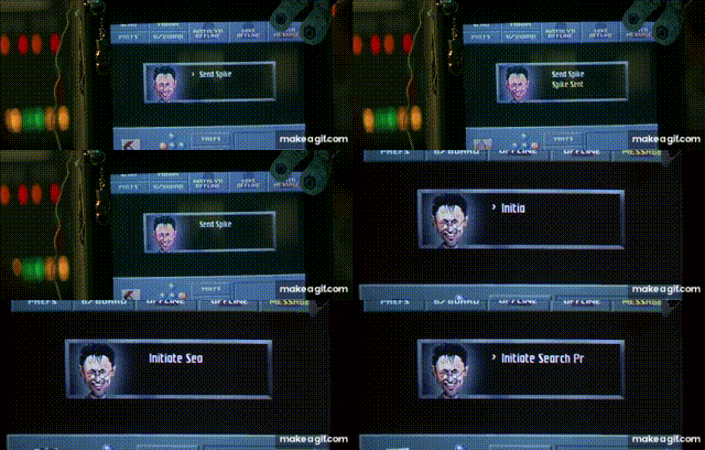
[Boris’ computer from the James Bond film, Goldeneye, courtesy of MGM Universal]
Perhaps this first example isn’t exactly a fair contender, as the interface in question is very hard to separate from its user. In fact, the character's face is actually incorporated into the software’s UI itself. Yes, that’s right–I’m talking about none other than Boris Grishenko from 1995’s GoldenEye.
Aesthetic ★★★☆☆
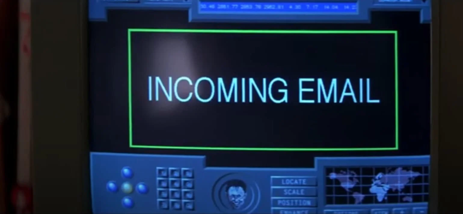
Clearly this isn’t a realistic, professional software product we’re dealing with. The look and feel is more reminiscent of a CD-ROM-era computer game than something you would expect an intelligence officer to be using. But this is a James Bond flick we’re talking about. Camp comes with the territory, and UIs are no exception. The clunky controls and caricature mockup of Boris’ face give the UI a loveable charm that has stood the test of time.
[Boris’ computer from Goldeneye, courtesy of MGM Universal]
Ingenuity ★★★☆☆
Back in 1995, mass computer literacy was still in its infancy, so designers weren’t able to take too many liberties when crafting interfaces for the big screen. This resulted in many film UIs of the time taking on more cartoonish looks (think Jurassic Park or Hackers). In GoldenEye, this stripped down aesthetic easily allows Boris’ program to clearly communicate to the audience that a) a search has been initiated and b) a “spike” (retro hacking term?) has been deployed in just a few seconds. It may be very cut and dry, but it gets the job done and effortlessly moves the story along in the process.
[Boris’ computer from Goldeneye, courtesy of MGM Universal]
Impact ★★★★☆
As the GUI’s and its main user, Boris, are kind of one collective character, assessing the UI’s impact is open to many interpretations. As a character, Boris–despite working for a government agency–very much channels the free-spirited, optimistic, cyberlibertarian hacker energy of the mid 90s. And although it’s doubtful a character like this would be cast in today’s pious cinematic landscape, it’s also hard to refute the lasting legacy GoldenEye’s Boris Grishenko has had. But don’t just take my word for it–even GQ deemed him to be the real style icon of the film.
2. Blade Runner 2049
The 1982 release of Ridley Scott’s Blade Runner is widely considered one of the best films of its genre, so Denis Villeneuve had some pretty big shoes to fill when he took on the role of director for the franchise’s 2017 sequel.
Aesthetic ★★★★☆
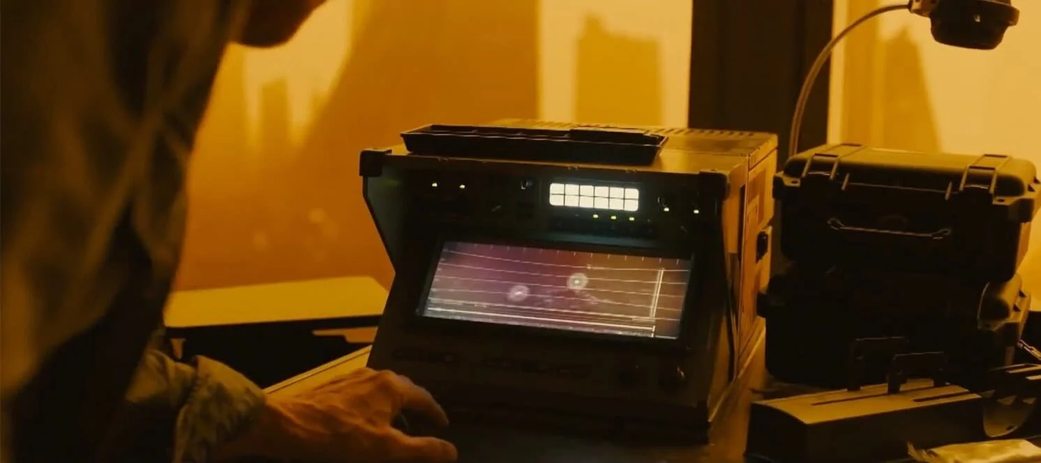
Make no mistake: the Blade Runner 2049 universe is very broken, and the creators wanted this mood to be transferred into the devices its characters used. Director Denis Villeneuve told his team to “avoid even thinking that electricity was a commonly available power source,” which undoubtedly contributed to the grimy bleakness of the film’s interfaces. The GUIs were also used to contrast class in the film. This is best demonstrated by the brightness of the devices the more privileged characters are seen using (see Wallace Corp limo image below).
[screenshot from a computer in Blade Runner 2049, courtesy of Warner Bros. Pictures]
Ingenuity ★★★★☆
Playing an integral role in building the Blade Runner universe, the team responsible for most of the interfaces we see in the film had to get creative when searching for inspiration. Their efforts ranged from taking hints from the old library and archival computer programs to finding inspiration in e-ink screens, which rely on microcapsules filled with positively and negatively charged particles to create contrast–a normcore approach to UI.
[screenshot from an LAPD computer in Blade Runner 2049, courtesy of Warner Bros. Pictures]
Impact ★★★☆☆
The interfaces in this film generated a pretty large buzz within certain UI circles, with some commentators going as far as saying that the UI itself was the most compelling character of the whole film, a bold claim considering its star-studded cast. I believe it’s safe to say that Blade Runner 2049 raised the bar of what viewers can expect from UIs as storytelling devices, so it’s rightfully earned the second-place spot on this list.
[screenshot from a computer in Blade Runner 2049, courtesy of Warner Bros. Pictures]
Check out our archive of resources
Get Free Resources like design tools and masterclasses from the Fountain Institute.
1. The Matrix, 1999
[The Matrix command-line interface, courtesy of Warner Bros. Studios]
The Matrix trilogy is in no short supply of great UIs. Whether Neo’s fellow resistance fighters uploading different martial arts disciplines into his mind or Morpheus’ hovercraft, the Nebuchadnezzar, docking in Babylon, the trilogy’s UI game is strong. But when it comes to lasting notoriety, nothing from the trilogy matches the iconic moment when Neo initially comes into contact with “the real world”.
Aesthetic ★★★★★
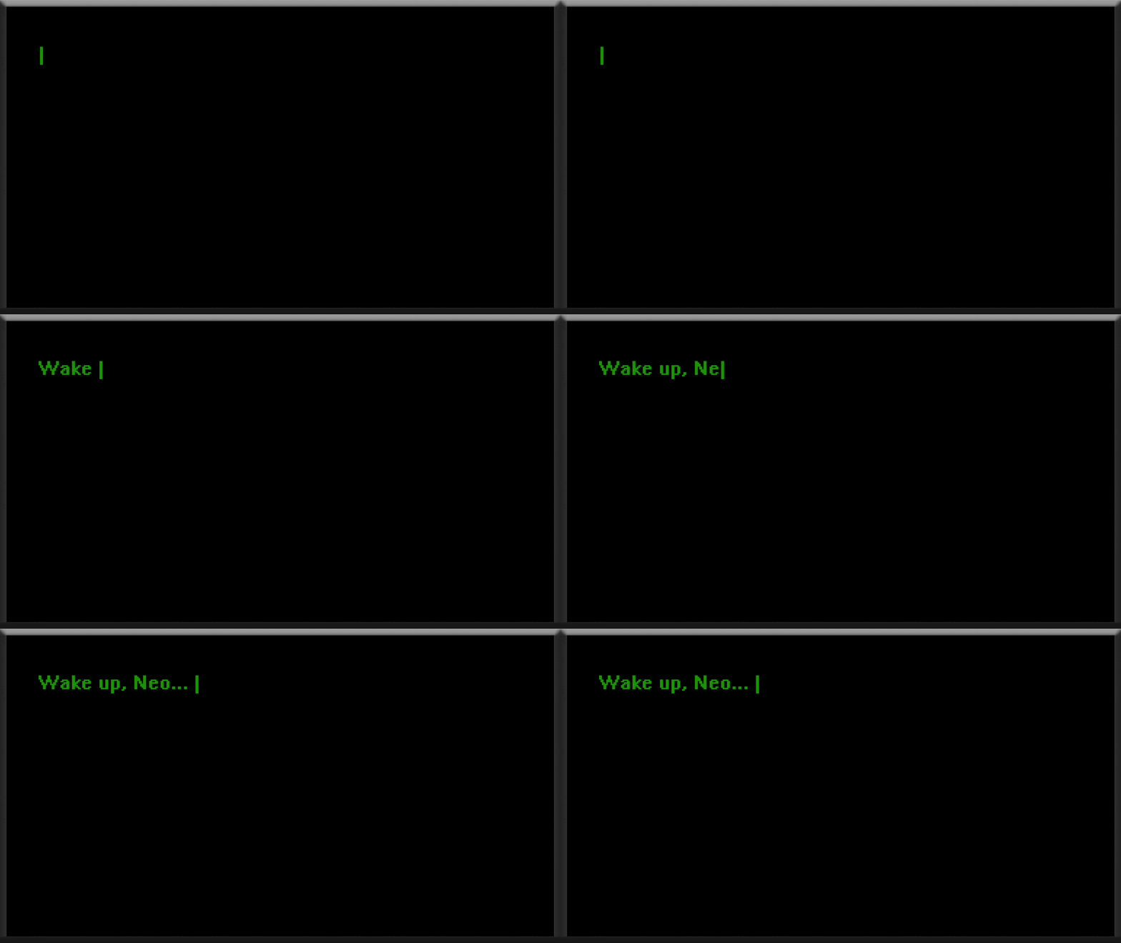
Neo’s first interaction with his future wife and savior, Trinity, is truly memorable. The Wachowski Bros opted for a completely no-frills terminal-like interface for this scene. The slow cadence of the text trickling onto the screen and the machine’s old-school processing noises work well together to build suspense and fully grab the viewer’s attention. The use of plain text helps emphasize the scene's double meaning: Here, we see a sleeping Neo being told to wake up just moments before he is sent down the rabbit hole to be figuratively woken up from his simulated existence.
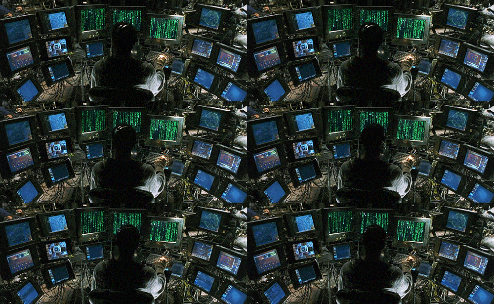
[The hacker setup in the Nebuchadnezzar, courtesy of Warner Bros. Studios]
Ingenuity ★★★☆☆
Arguably, a metaphor-based approach to the UI would have lessened the gravity of this moment. A more transparent and detailed UI would potentially take some of the eeriness or uncanniness away from Neo’s initial exchange with Trinity. This is because the vague, cold, and intransparent medium of anonymous plain text seemingly leaves Neo with doubt and insecurity regarding his interlocutor. Just like The One, we, as the audience, are also uncertain and somewhat weary about who is lurking on the other end of the screen.
[“Wake up, Neo…” the call to adventure from the Matrix, courtesy of Warner Bros. Studios]
Impact ★★★★★
Interestingly, the first UI element we see from a film franchise made famous for its CGI is nothing more than a plain text-based user interface. Many films have arguably since one-upped the UIs from The Matrix series (I’m looking at you, Minority Report), but few remain as iconic as this initial scene juxtaposing Neo with his desktop monitor. The current transition we’re experiencing from metaphoric UIs to text-based conversational UIs, empowered in part by ChatGPT and Bard, only further cements the timelessness of the scene.
More on fictional user interfaces (FUI) in film
Read How Minority Report Trapped Us in a World of Bad Interfaces by Christian Brown
Read Why all of Hollywood UI looks the same by Daley Wilhelm (members-only story)
Read A look at how UX/UI design is portrayed in popular media by Coren Feldman
Read Why Her Will Dominate UI Design Even More Than Minority Report by Kyle Vanhemert
Watch this playlist of Fictional User Interfaces from movies by Alexander Wurnig
Check out this Pinterest board full of inspiring fictional user interfaces by Sarah Kay Miller
What’s your favorite UI in a film and why?
Let us know in the comments below!


