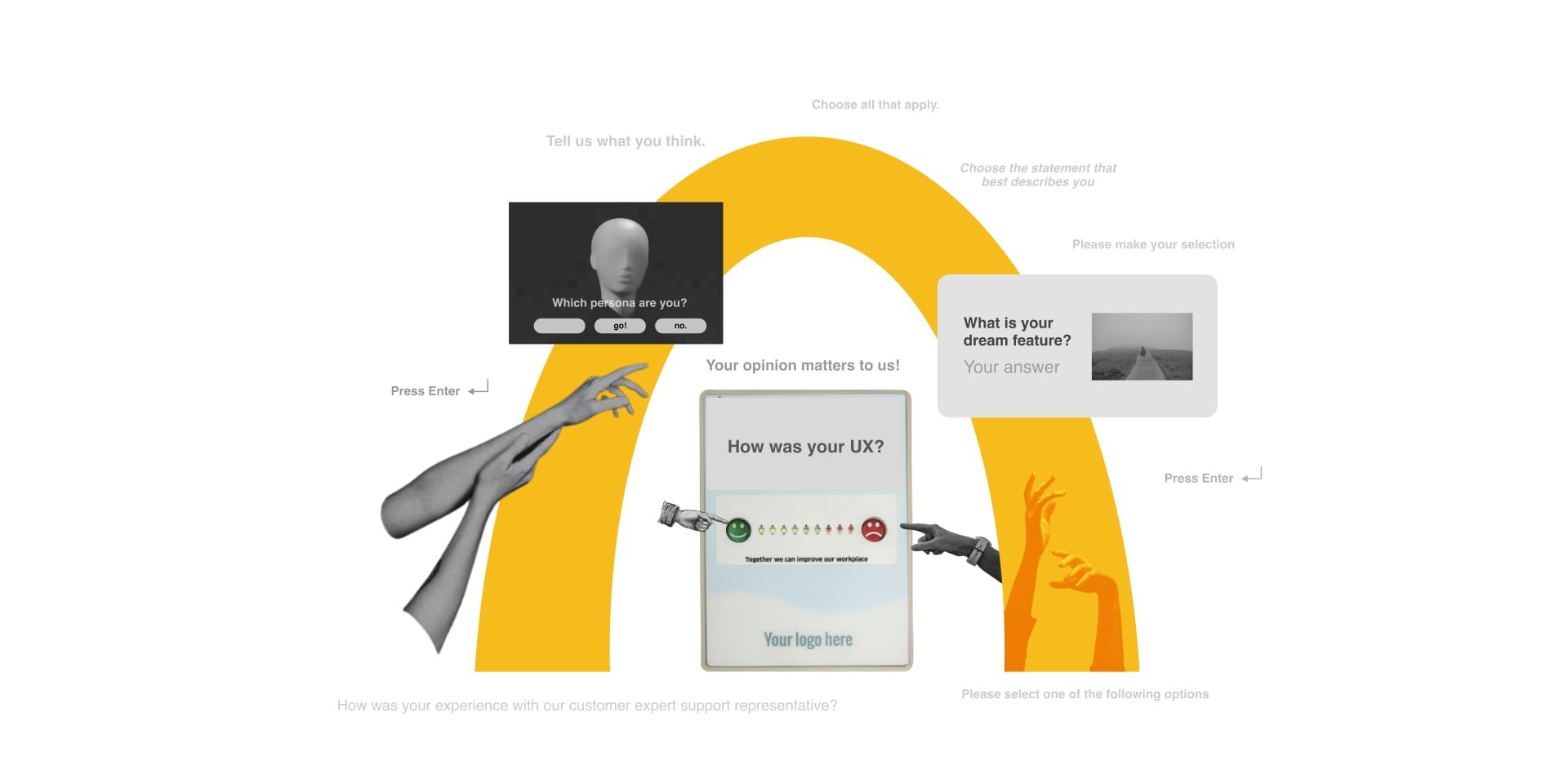
Surveys Are the McDonald’s of UX Methods
Why surveys can be terrible for you and how to design them without losing your dignity
Ah, the UX survey…the fastest way to get terrible ideas for designing products.
It’s never been easier to send surveys, and it’s never been easier to be wrong if you don’t know how to design them.
If there’s a method in UX that resembles fast food, it’s the UX survey. Just like McDonald’s, surveys give you a quick fix for cheap, but in the long run, your health is going to suffer.
Surveys are like McDonald’s because they’re cheap, everywhere, and terrible for you.
The worst part is that surveys can seem accurate, but in reality, they’re not. Let’s dive into what’s wrong with surveys.
1. Surveys are cheap.
Like fast food, surveys are cheap to send, but good survey design requires time, making them much more expensive than you think.
Survey design and analysis can be expensive.
While you can send a free survey with standard tools like Typeform, SurveyMonkey, HotJar, UXTweak, Google Forms, and Sprig, you still need someone to design and analyze the results. While the tools make it cheap, you can make costly mistakes if you don’t set them up properly.
Designing good surveys takes time. Without a proper survey setup, those cheap tools will be put to the wrong use. And you might have to spend even more time undoing the damage of faulty survey results.
Analyzing surveys also takes time. Suppose you don’t take the time to look at the math behind your survey results. You might report the wrong results. Many teams forget the analysis stage of the survey process. It’s important to remember that it takes time to analyze, and you should definitely include that in your survey budget.
Surveys have the worst qualities of qualitative and quantitative methods.
Most UX survey questions resemble quantitative methods, but most designers don't use the proper statistical tools to make them accurate. They look data-driven, but those pretty charts and graphs are a beautiful and dangerous lie without suitable sampling sizes.
Some open-form questions resemble qualitative methods, but the responses aren't as trustworthy without context. The order of the questions or the desire for the respondents to answer favorably can drastically change the answers to questions. There are similar dangers in any qualitative study, but the lack of context means when it goes wrong, you'll never know.
Surveys promise qualitative and quantitative insights, but without expert guidance, they deliver neither.
Cheap means surveys get used over more accurate methods.
Surveys are especially hard to resist when you're low on time and money. Qualitative interviews provide richer insights, but you will probably have to spend at least thirty minutes per interview. That can get pretty expensive. Surveys offer some quick data at a fraction of the employee cost. This cheapness comes at a price, but often that cost isn't felt until your poorly administered survey yields misleading results. Those misleading results can cause you to make costly decisions.
Surveys are cheap, but like fast food, that cost will eventually hit you.
2. Surveys are everywhere.
Just like the fast food locations spreading around the world, surveys are hard to escape. It’s hard to surf the internet these days without somebody wanting to know what your opinion is.
Popular doesn’t mean good.
Surveys are a popular method. According to a—uh, survey—from User Interviews, non-screener surveys is in the top three.
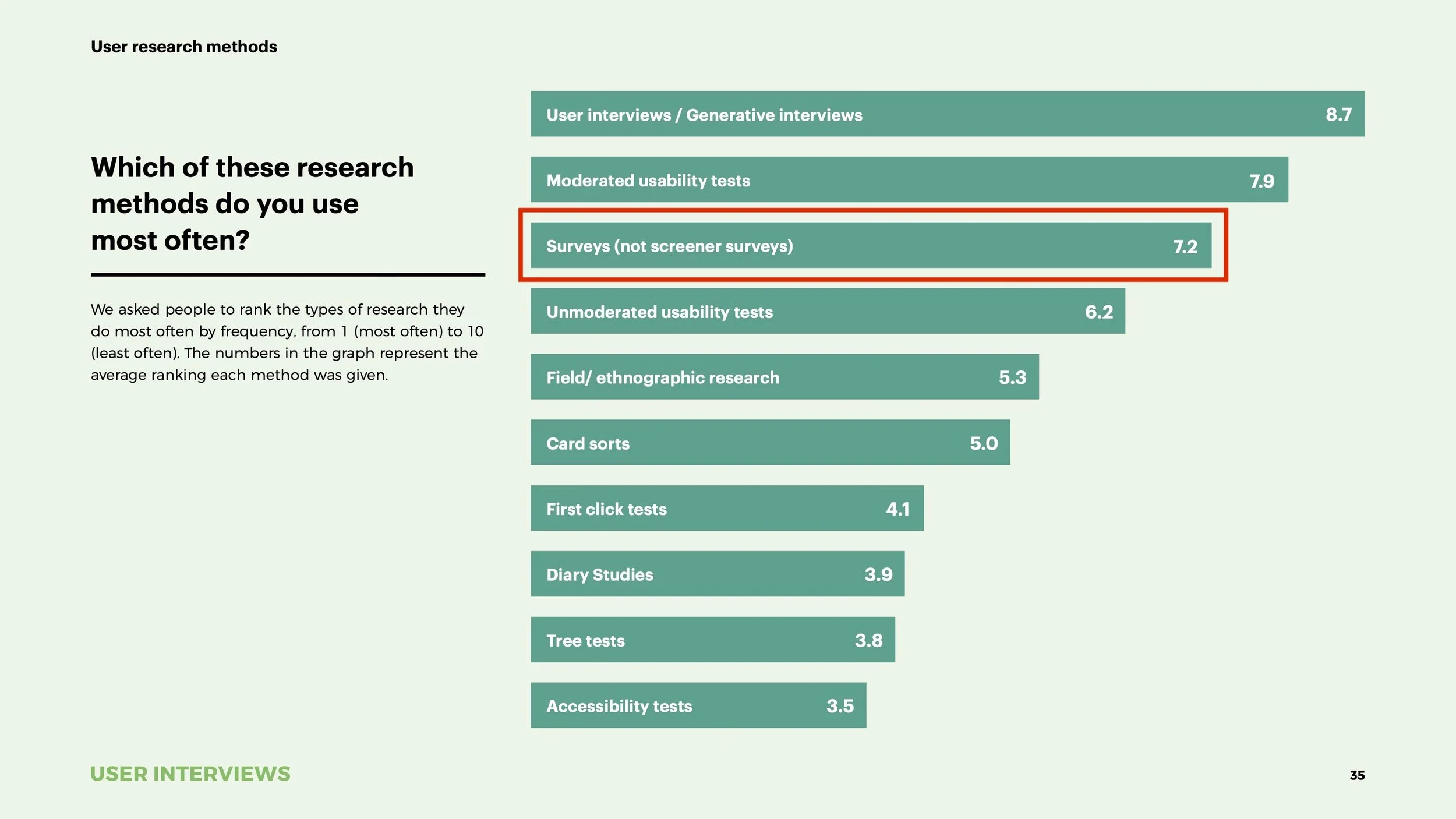
[based on the responses of 525 people that do research for their job, image from the State of User Research Report 2021 by User Interviews, red highlight added by us]
There’s no denying that surveys are a popular method. But this popularity isn’t necessarily a good thing.
McDonald's is the most popular restaurant globally [source], but I don't take that as a sign of their food quality. I think the popularity of McDonald's is a result of its convenience. It's the same with surveys. Please don't take the popularity of surveys as proof that the data is trustable.
Untrained practitioners abuse surveys.
It's standard for UX students to include survey results in their portfolios, and it's hard to find an open design Slack without tons of survey requests. You have to start somewhere, but at least junior designers are trained in alternatives. Most marketers and product people don't know how to do usability testing or in-depth interviews. Surveys are their only option, so they use them a lot, even if untrained on the biases involved (more on that later).
Companies tend to over-survey.
There are so many survey tools that each team has its software stack for sending surveys. The data from survey tools don't connect with other tools out of the box, so companies ask the same thing in multiple departments. The product team might ask about customer satisfaction with an NPS, while the marketing team surveys after a customer support ticket. It's so easy to set these surveys up that the whole thing is automated, and even the companies don't know how many they're sending.
The result of all this over-surveying is called Survey Fatigue, and it's getting worse every day. Even before online survey tools, people were sick of surveys, as illustrated by this chart from Pew Research about the effectiveness of their surveys from 1997 to 2012:
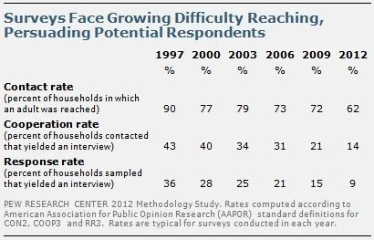
[survey response rate went from 36% in 1997 to 9% in 2012, from PewResearch.org]
To avoid survey fatigue, don’t survey.
So how much surveying is too much surveying? I would argue against setting up any automatic surveys that poll your entire audience. If you want to poll your audience, only do it if it's the only way to get the information you want. Smaller, contextual polls will reduce survey fatigue.
It's hard to come up with a guideline for too much surveying. Most of the advice you get will be from surveying company blogs, and they mainly offer advice around reducing cognitive load for the survey taker. You can design the perfect survey, but it will annoy customers if you send it out once a week. Very few offer advice on how often, but I found an interesting approach from Qualtrics:
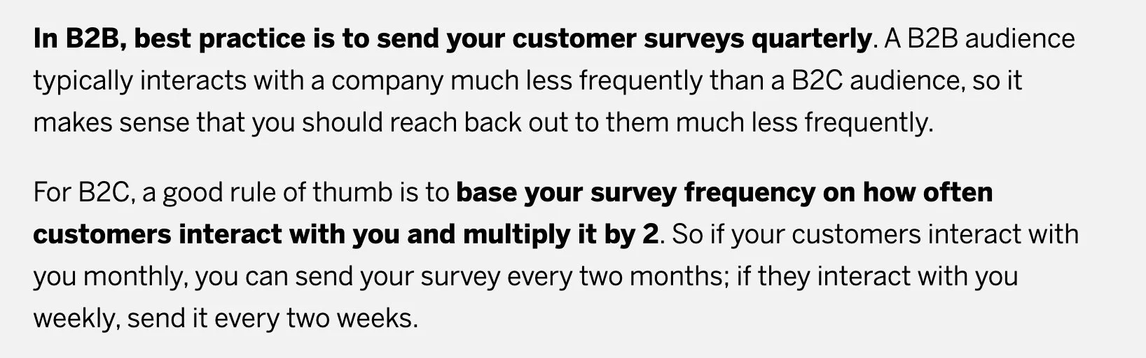
[a very biased estimate from a Qualtrics article]
That feels like a lot. It's not surprising that Qualtrics went liberal with their estimate since they make more money if you survey a lot. I wouldn't trust that estimate, but I like the approach. I would go 4x what any survey tool blog tells you. So once a year for B2B and 8x your average customer interaction for B2C. When deciding how much to survey, put the customer's perspective first, and use your best judgment.
I like Erika Hall’s approach. Do this to build empathy for survey fatigue:
Before anyone runs a user research, feedback, or customer satisfaction survey, they should be required to keep a diary of every single survey they are presented with over the course of a week.
— Erika Hall (@mulegirl) March 3, 2019
3. Surveys are terrible for you.
Much like fast food, surveys taste good in the moment, but in the long term they can make you sick.
Because surveys are self-administered, there’s a very high chance that things will go wrong. If you’re surveying in person, you can spot the issues, but once you’ve sent out an online survey, there’s no going back.
Surveys can create bias by design.
It’s painful to watch hundreds of people misunderstand your question. Watching companies use poorly designed surveys to make decisions is even more painful. Here are some common issues to avoid while creating surveys.

Sampling Bias is a common type of Sampling Error that occurs when you think that your survey respondents represent the views of the larger group when they don’t. For example, if you have 10,000 users, you need to complete your survey by at least 1,937 of them to represent the entire user base. Sampling bias might not seem evident unless you’re a statistician, so your instincts won’t necessarily help you. To ensure you have a representative slice of your user base, use a sample size calculator tool to be safe.
Acquiescence Bias is a common type of Response Bias that occurs when survey takers respond in a way that seems agreeable or gains the researcher’s approval. For example, if you use ask users to agree or disagree with the statement, “I prefer to be alone,” most people will tend to agree. To avoid this, include “I prefer to be around people” as well. Keep a balanced number of positive and negative options in your choices to prevent leading respondents towards this natural desire to please.

Question Order Effects are a common type of Survey Response Effect that occurs when earlier questions linger in respondents’ minds and influence later questions. For example, if you initially ask users about financial details, you might prime them to answer the last questions based on market rather than social norms. Try to randomize the order of the questions and choices in your surveys, and be aware that the order of questions can affect your results.
Even the tiniest issues in your survey can have huge effects. Take extra care when designing surveys and read up on Sampling Errors, Response Biases, and Survey Response Effects before blasting out surveys to your audience.
Survey results can encourage bad decisions because they always appear trustworthy.
How do you know if survey results skew because of question order, poor sampling, or acquiescence bias? If you’re a decision-maker looking at a neat little graph in a meeting, you don’t. All you see is something that looks like reliable data. Here are a few ways that surveys can create biases in the people that have access to them.
Availability Heuristic occurs when we make decisions based on things that are easy to retrieve in our minds instead of considering the whole gamut of options. It’s a shortcut our brains take for us, and survey results are very tempting for their availability in our minds. Which is more likely to influence your decision, a graph showing behavioral data from a survey or a list of research insights from customer interviews? If you’re not careful, the availability of quick and easy-to-share visuals that appear to represent group user behavior will trump more accurate and in-depth research. Be aware that decision-makers will have this bias and only provide graphs and summaries of user behavior if they represent the full picture.
Anchoring Bias occurs when a reference point like a number influences people. Anchoring can happen when poorly designed surveys create extreme user opinions that, while biased, will be hard to remove from stakeholder memory. For example, if you ask a survey question like, “I would like a feature on _____.” you are likely to get “yes” responses due to the Acquiescence Bias. If you graph these answers out, you will get a powerful graphic that will bias any discussion of the feature towards the idea that “users want this thing.” To avoid this, only show graphs and summaries if you are 100% they represent the views of your user base as a whole and come from unbiased surveys.
Because survey respondents can’t explain their answers or provide any context, even survey designers cannot see the trash data hidden beneath a biased and poorly designed survey. If any of this information makes you anxious to survey, you are becoming aware of the true nature of surveys. Surveying can have dangerous long-term effects on decision-making, and you should think twice before surveying. If in doubt, use analytics and in-depth interviews instead.
How to make better surveys
Oh, you’re still here?
You can’t resist the temptation of cheap and easy customer data. You should get some tips for avoiding all the problems I’ve outlined. Ok, here are some ways you can prevent biases in surveys.
If you’re not going to analyze the data, don’t survey.
If you’re automating surveys, you might have more data than you can ever analyze. Only survey when you know why you need the data, and you will prevent survey fatigue at the source.
Write surveys with user-centric language and avoid jargon.
Your surveys should be considerate of the user and use their language. Start your survey design process with a few interviews if you don’t know how to put things in their language. Like all things in design, take a user-centric mindset, and you’ll avoid problems in understandability.
Do a pre-test with at least 3 testers from diverse backgrounds
A user-centered mindset only gets you so far if you’re not checking your ideas with the user. Check your survey by watching users take the survey while speaking their thoughts out loud. If you don’t have access to a user to test quickly with, try a colleague who isn’t close to the project. If you don’t test the survey with a diverse group, you will have blind spots.
For example, if you’re a white, cis-gendered man designing a study, you will create the survey based on your background, which is not representative of your user base. Find colleagues of different ethnicity, gender, religion, and political beliefs to pre-test your survey.
Use open-ended questions to reduce blind spots but keep the survey brief.
Open-ended questions allow you to be surprised by the answers of your respondents. Questions with open text fields will ensure you don’t limit the responses so much that you fail to learn big things.
In general, open-ended questions take more effort from the survey taker. If you want to optimize your survey for completion, don’t add too many question options or use too many open-ended free-text questions. The easier it is to complete your survey, the more accurate your results will be. You can reduce the cognitive load by grouping questions, simplifying language, and even by adding emojis.
Treat results as inconclusive until you have the right sample size.
Most organizations have a response rate of around 20% [source], so you might have to send your survey to many users to get a statistically significant amount. A sample size calculator tool will help you know if you have the right numbers. Try this one from SurveyMonkey if you’re new to sample size calculators.
Poor survey design means you shouldn’t treat your answers like proof, even with an accurate sample. Consumer opinions are relative, not absolute. Use behavioral testing methods like A/B tests or analytics for evidence and survey results to guide more research.
Don’t use survey graphs unless you understand the margin of error.
Tools like Typeform make it easy to visualize your search results with graphs and charts that obscure the data beneath. If you don’t understand the fundamental biases and sampling sizes, don’t use these charts and graphs, as there is a high chance they’re incorrect.
Calculate your margin of error before showing any graphs. You can use this tool from SurveyMonkey to do that. Once you get a solid understanding of the statistics, you can use the graphs to aid decision-making.
Spend a full day designing your survey.
Surveys are challenging to design if you haven’t figured it out already. You're in trouble if you think you can send a survey out in an hour. Generally, expect to spend an entire day researching, iterating, testing, and polishing your survey.
Learn More about Surveys
Try these survey tools for Survey: Monkey Margin of Error Calculator & Sample Size Calculator
Play around with this Sampling Tool Calculator by Checkmarket that includes response rate
Read On Surveys by Erika Hall
Read Best Practices for Survey Research by the AAPOR
Read The Designer’s Guide to Testing & Experimentation by Jeff Humble
Use the Experiment Cards to design experiments around surveys
See how surveys can fit into a continuous UX research practice in Unlock Your Research Potential by Jeff Humble
Subscribe to The Fountain Institute Newsletter, and get more articles like this in your inbox every Thursday